Precious Metal Updates And Charts
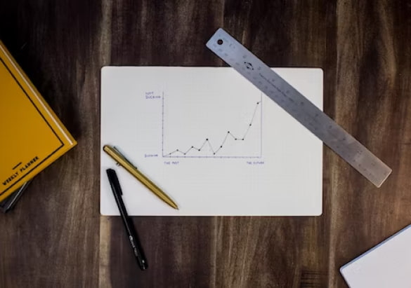
Welcome to our interactive charts and spot price page. We’ve created an interactive chart for all your technical needs. Want to compare gold growth versus the U.S. dollar? Simply click within the toggle boxes and the charts will appear. Want to view it across various time frames? We offer the ability to see graph and chart information for as short of a period as one day, or reaching as far back as the data for the index itself exists. Our clients typically like to see comparisons within 24 hours, or a week, a month, three months, six months, a year, or even 5-10 years. Our most popular comparisons are the U.S. Dollar index versus Gold, Silver versus Gold Bugs, Gold versus the S&P, and Gold versus the Dow Jones.

Spot Price Updates
Precious Metals Chart

Using The Interactive Charts
While these charts and graphs are not meant to be all encompassing, the savviest of investors will look for trends and opportunities to help gauge the relative strength of the metals market and other forms of investments. Using the U.S. Dollar versus Gold index chart, it is easy to see and compare the inverse relationship that typically exists between gold and the dollar. It is impossible to perfectly time any investment, and metals should be held for the long term, so getting started anytime is better than sitting on the sidelines entirely. For those that have never invested before, or those that already own some precious metals, we encourage you to continue to diversify over time to give you the best opportunity to take advantage of various market conditions.